
The typical customer is a company that sends at least a few hundred invoices per month. That could be your local cleaning company, a wine wholesaler, or your electricity company. The system typically has multiple employees in the system.
The main user is someone working in the accounting department. Now, people in accounting departments care about efficiency & powerful tools, more than shiny/sexy. However, what makes Likvido’s product different than an accounting system is you also invite people from other departments in (i.e., sales people, support).
That means, on the one hand, the product should be efficient/powerful. Hence, the accounting department is happy and sexy and shiny so the salesperson and founder understand what’s going on.
Likvido company has lately seen a drastic increase in competition. Other competitors have modern-looking websites and user interfaces, which is drawing Likvido’s customers away.
Financial products and services often seem to be boring, but they don’t have to be. In order to stand out, one must be different. Likvido needed to redesign their platform with a fresh and appealing new look to ensure existing customers are kept and new ones are converted.
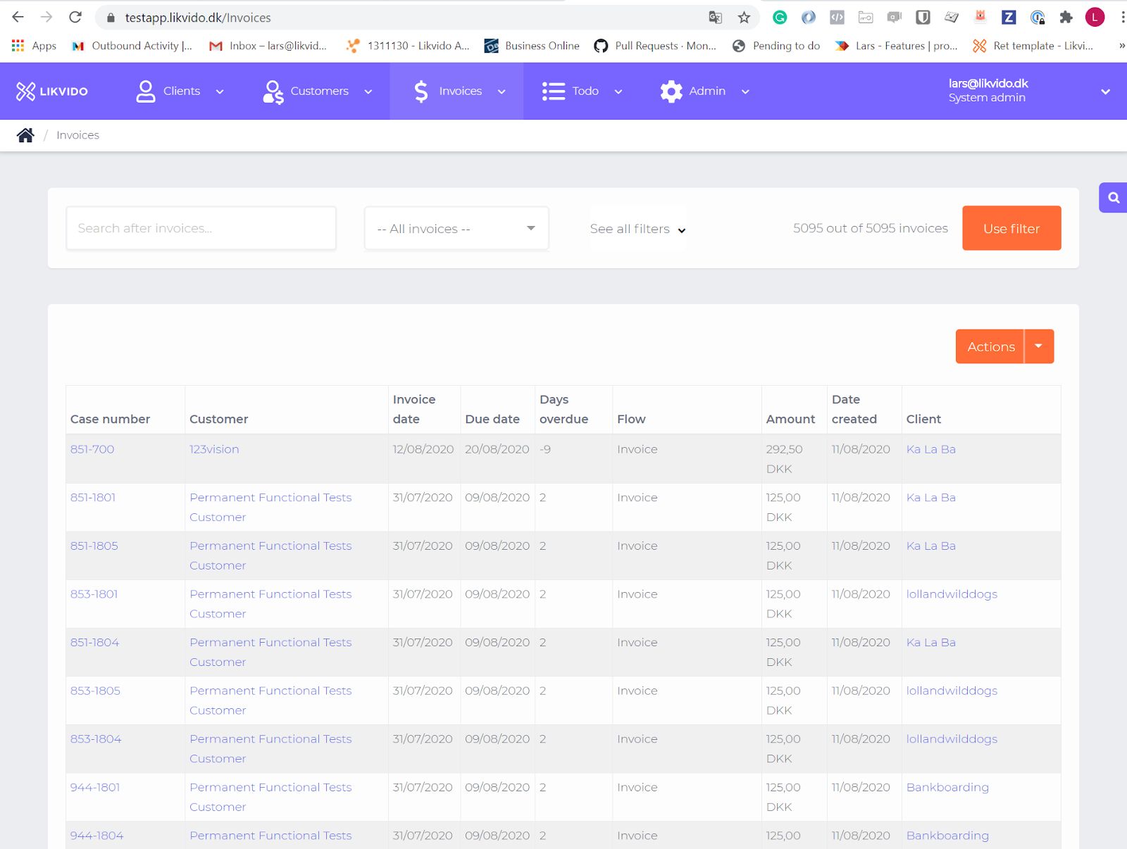
This particular project aimed to identify any usability issues with an admin invoice overview and determine the critical features that need to be redesigned to improve user experience. The company was also looking for a new modern-looking visual design for this page and needed help to identify any usability issues within the admin invoice overview.
I participated in creating a new admin invoice overview for the company Likvido. My aim was to come up with a new modern look of UI, add new functionalities, and improve overall UX. I have decided to redesign both the functionality and visual look of the admin invoice overview. I added or redesigned following UI elements:
One of the most important UI elements of a system like Likvido is tables. Lots of work are done by tables. That means:
1. Lots of checking specific data (i.e. searching) and see the status
2. Lots of sorting/filtering to understand numbers
3. Bulk actions on specific invoices
The most used page in terms of tables is the invoice overview. The invoice overview is an overview of all the invoices client has in Likvido. An invoice can basically have 3 stages:
- Invoice (meaning the invoice has been sent)
- Reminder flow (reminders are being sent to the customer)
- Debt collection (invoice is in a debt collection flow)
I have decided to redesign both the functionality and visual look of the admin invoice overview. I added or redesigned following UI elements:
Search field - I suggested unifying the search options. I created a one search field on the top of the admin overview. The user can search for any string/text and find/check specific data. (Invoice, case, client, etc.). The table data below should update each time the user performs a search. It would be nice to have an autocomplete search feature to make it faster to complete searches.
Calendar - I placed the calendar on the top, where the user can set the start and end date he looks for or choose among other options - display last month/year data or other specific dates, for instance, a fiscal year.
Current flow - I pulled out the current flow feature from the filter options, and I placed it above the table. The user can easily choose from the invoice stage options, and the table data will change accordingly. You can see the current number of invoices at a specific stage displayed right next to the stage name.
I added an option to show and hide filters that the user doesn’t want to see. It should work as a dropdown where the user can select/deselect the filters. I recommended the client to add “a favorite filter feature” - the user can create and save customized filters for later use. The new features should be tested with real users
A dropdown appears when you hover over a filter option. I added a search field to quickly find a partner/client or other specific data and the “Select all” option. The search field should be used only where it makes sense. I wouldn’t add it to the filter category: country, conditions approved, etc. since there are fewer options to choose from.
The next feature I added to the overview is clear filters. I’m not sure how the current filtering overall works, but it would help to filter data automatically without selecting the apply filter button every time.
I rearranged the filter options as I thought would be the best, but since I don’t have much data about your users/customers than it would be nice to test the new admin overview with real users and find out which filter features are the most used and then change the filter options layout accordingly.
Bulk actions - the bulk actions feature enable the user to perform bulk updates to a list of specific invoices. (end case, change the flow, put on hold, exporting data, moving to the trash, and other actions useful for the user)
Standard controls - Checkboxes could be used instead of dropdowns when a user selects one or more options of a limited number of choices. (Invoices, Customer).
Another improvement of the UX is “Radio buttons” - they are used to filter options where only one option can be selected at the same time. (Choose foundation, Conditions approved)
Sorting on columns - Columns could be sorted alphabetically when there is a text (customer, client) or by ascending and descending order - numbers, dates. The upwards and downwards arrow symbolizes the different sorting. The sorting options should be saved for later use.

If you have a project or collaboration that you would like to discuss with me, or if you are curious to hear more about how I can help you, I look forward to hearing from you.
hello@miloslacko.sk